
The New Control Center Continues to be My Favorite iPadOS 18 & iOS 18 Feature
One small feature can make a big difference.

I’m back from holiday break! Thank you for patiently waiting through the holiday season, I did work on some new content for the new year over my hiatus, and am excited about some of the projects I’ve been working on for the SubStack that I will hopefully be announcing in a few months. But I figured I would reflect on my favorite feature so far in iPadOS and iOS 18, now that it’s been most of a year and I’ve had a chance to really incorporate some of the new features into my workflow.
For years, the Control Center has acted as a quick way to access critical device settings and functions. Also, for years, it was not very customizable. There were only a handful of additional control options that could be added in addition to the default ones. But as you probably have already heard, iPadOS 18 and iOS 18 changes that with a new Control Center design that allows for full customization. I figured now that I’ve been using the new Control Center for several months since the first developer betas for iPadOS 18 became available, I’d write about how I’ve been using the new options to make the most of it for my workflow.
Siri Shortcuts Belong in the Control Center
They really do. The Control Center feels like a very natural home for shortcuts. For those who may be unfamiliar with Siri shortcuts, they are built with iOS’s Shortcuts app, and provide users with a simple and intuitive way to create custom automations for their devices. Now, for the first time, iOS allows users to pin their shortcuts within the Control Center. This makes shortcuts far more accessible across the system. Rather than having to leave an app to launch a shortcut from a widget or bookmark on my Home Screen, on the iPhone, or do the same or allocate valuable App Dock space to bookmarks on the iPad, now I can simply swipe open the Control Center and access all of the Shortcuts I use to streamline different parts of my workflow. Combined with the ability to create additional Control Center pages, I can even choose to organize my shortcuts by category if I wish. And the iPhone adds in addition the ability to remap its Lock Screen buttons to custom shortcuts. I’ve replaced the camera button on my iPhone’s lock screen with a shortcut that opens a list of favorite contacts, and calls the contact I select from the list. This is convenient when I need to make a quick call and don’t want to spend the extra time navigating to the Phone app.
Of course there are some shortcuts that still make more sense on the Home Screen or App Dock. Custom app icon shortcuts for example only work on the Home Screen, since the Control Center simply displays either the Shortcut app symbol, or symbols selected from the “Choose Icon” menu in the shortcuts app, not custom images like the “Add to Home Screen” option in Shortcuts. But many of the Siri shortcuts that I use regularly for my workflow fit naturally in the context of the Control Center, and being able to access these shortcuts without having to leave my workspace has really streamlined things, and I’ve been tinkering with more new Siri Shortcuts to add into my workflow.
Customization is a Big Improvement
The new Control Center’s multi-page layout allows for much greater customization and organization. I choose to keep my “front” Control Center page mostly stock, with the addition of some useful Siri Shortcuts at the bottom. But now with the ability to add new pages to the interface, I can also choose to load Siri shortcuts into separate pages and even organize them by page if I wish as I mentioned before. I haven’t done so yet, but I may eventually consider adding some categorized pages.
Rearranging and resizing controls is also very useful for greater organization and accessibility. It’s handy to be able to size a Siri Shortcut so that its name is visible in the Control Center, though I usually assign a symbol for my shortcuts in the Shortcuts app, which allows me to use most of my shortcuts in the Control Center as a compact button with only the symbol visible. Still, there are several shortcuts where just a symbol isn’t enough, so having the title visible is very handy.
As to the default system controls that appear in the Control Center, as I’ve also already mentioned, I haven’t really made any changes to these, I’ve largely left them in their default arrangement on the first Control Center page. This is mostly due to habit, I’m familiar with that control layout, and I don’t find any added utility by rearranging it.
The New Default Pages Improve Functionality
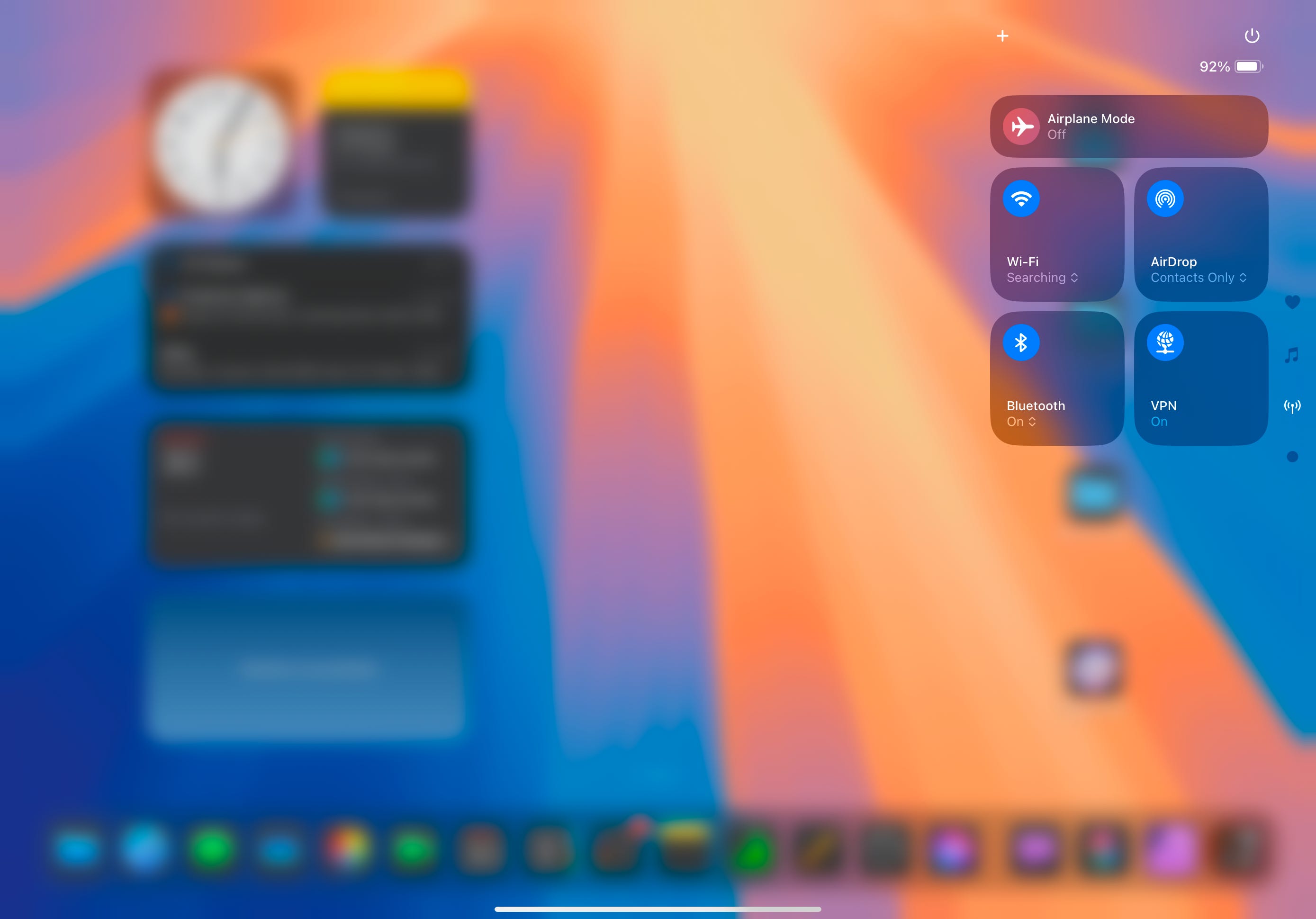
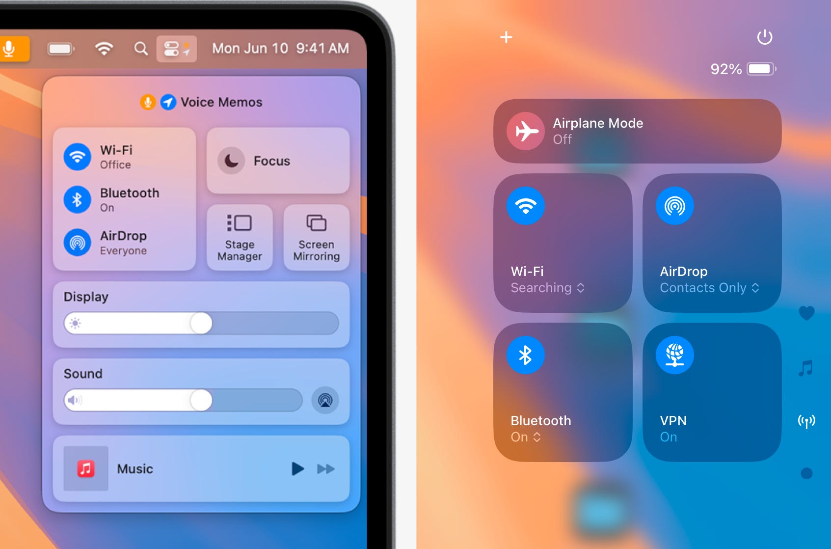
Another point that I wanted to see improved with the old Control Center was the network options and controls. In the macOS Control Center, the “big block” (such a scientific term, I know) that houses network options displays the Wifi, Bluetooth, and AirDrop controls in a list view, also presenting more information about the current status of these settings. The biggest difference can be seen with the wifi setting. In the macOS Control Center, the currently connected wifi network is displayed with the Wifi button, so you can easily see which network you’re connected to at a glance. This is particularly useful for me because I use a wifi extender to extend my wifi signal in the house, and as I move around in the house, my device connects to one or the other depending on where I’m at. But in some places, the two overlap, which means that sometimes my iPad doesn’t connect to the stronger wifi signal because it’s still within range of the first wifi network. Before with the old Control Center, it took several clicks/hold presses to see what wifi network I was connected to. With the new Control Center, Apple has incorporated a dedicated “Network Controls” page, which surfaces all of the data visible in that macOS Control Center box, but also additional network settings as well such as VPN settings and AirPlane Mode status. And with the iPad Control Center’s new customization options, I could also choose to add a dedicated wifi control that displays the network I’m currently connected to on the first Control Center page. This alone has made a big difference for my workflow, it’s much faster and more efficient to view my network settings than it was with the old Control Center.
Perhaps less useful, but a new page I like nonetheless is the new “media controls” page. This is like an expanded view of the “Now Playing” control in the Control Center. It displays a bigger view of an album’s cover art, along with the usual play, pause, fast forward, and rewind controls. It also includes options for volume control and AirPlay settings. I don’t end up using this page very often, but it’s still a nice addition.
The New Control Center Can Incorporate macOS Menu Bar Features
With the new Control Center redesign on iOS and iPadOS, both of these platforms can gain many of the best features of the macOS Menu Bar. Nearly everything that the right-hand side of the macOS Menu Bar can do can now be done in the iPadOS and iOS Control Center (also on the top right side of the screen). There is still a gap in functionality where third party apps that offer Menu Bar applets on the Mac still haven’t incorporated similar controls into the Control Center, but this will likely improve as time moves on. And already, some apps have created new Control Center toggles for core features in their apps. This will likely also improve with the expanded App Intents system Apple announced at WWDC24, which is rumored to be coming in iPadOS and iOS 18.4. App Intents are what allow Siri and Siri Shortcuts to trigger features in third-party apps, so it stands to reason that improvements here could also extend to more Control Center apps coming down the road. For the time being, the apps that have delivered Control Center toggles give us a bit of a taste of how this new integration can radically improve productivity on iPadOS in a way that’s similar to macOS Menu Bar applets and toggles. It also seems that Apple is using the Control Center as a catalyst for greater unification between their platforms. I could envision Apple bringing similar Control Center customization to the Mac, and in turn, adding the ability to move macOS Menu Bar applets into the Control Center with either the same toggle system that iPadOS and iOS now offer, or perhaps a Mac-specific system. Either way, it would create more parity in terms of the user experience between the two systems, something that Apple definitely seems to be working towards.
System Utilities Can Make More Sense as Control Center Applets than as Home Screen Apps
One intriguing control I noticed for the Control Center is a full-blown Control Center applet called Print Center. This is a utility that’s included as an app on macOS that can be found in the Utilities folder. It provides options for things like print order, checking print status, etc. Before, there was no surface visible way I’m aware of to access this utility in iPadOS and iOS. But now, in the “Add Controls” menu for customizing the Control Center, there is an option for Print Center under the “Utilities” category. When this is added to the Control Center, tapping it opens a separate app window with the Print Center app, very similar to the way this utility app works on macOS. It shows up just like any other app window in Stage Manager and the app switcher on iPadOS. It shows up as a separate window in the app switcher on iOS as well. This is an interesting inclusion, and I think it may provide us with a hint about future changes.
Some system utilities that people have wanted to see included in iOS and iPadOS such as a clipboard manager, audio manager, etc. would be kind of awkward as a Home Screen app on iOS and iPadOS. They could be added as separate Home Screen apps, but I don’t imagine this would be a very convenient system on iOS or iPadOS, this kind of implementation has always felt a little awkward to me on macOS in the first place. But the new Control Center provides an opportunity for Apple to rework how users access these system utilities. They can still act like an app, but can be accessed system-wide via the Control Center. This is something I will be interested in watching to see if Apple incorporates more system utilities into the Control Center in future updates. For the meantime, the new Print Center utility in the Control Center shows the way for how similar system utilities could be integrated into iPadOS and iOS in the future.
Future Outlook
Having used the new Control Center design on iPadOS 18 for the past months since the first betas dropped last summer, I’ve found it to actually make some pretty decent changes for my workflow. I find myself using Siri Shortcuts more often now that they’re easily accessible system-wide, and some more minor changes like the ability to quickly see the wifi network I’m currently connected to have proven far more efficient and convenient than the old Control Center design. It definitely remains my favorite iPadOS 18 feature. Some of the apps I’ve been hoping for Control Center toggles the most still haven’t added any such Control Center integration, but I’m hopeful that this will improve with time, and as Apple adds expansions to their App Intents system for apps to integrate their core features with Siri and Siri Shortcuts and Apple Intelligence. I’m excited to see what more third-party apps will do with the new Control Center controls. Perhaps more music apps like Spotify could make use of the system to provide controls to play a specific playlist from your music library? Play the latest episode of your favorite podcast? Perhaps Cloud Storage apps and similar utilities could provide controls for things like checking on file uploads, syncing files, or other such things. As I said before, I think that things will improve on this front with time and with the aforementioned expansions coming in future iPadOS and iOS updates. For now, third party app Control Center toggles haven’t made much difference in my workflow, but only because the right apps have yet to make use of them. I hope this will change and more of the apps I regularly use will begin to make use of these new options.
Overall, the new Control Center design looks very promising for incorporating more readily accessible functionality within iPadOS and iOS. I’m excited to see how it will continue to improve in future updates.